.png)
_gif.gif)
LOGO REDESIGN . OYENMENUWA AGHEDO. LOGO REDESIGN. OYENMNEUWA AGHEDO. LOGO REDESIGN. OYENMENUWA
HEX : #F22E30
RGB: 242, 46, 48
RGB: 242, 46, 48
HEX : #034AA6
RGB: 242, 46, 48
HEX : #7BBF49
HEX : #F22E30
RGB: 242, 46, 48
HEX : #8C5B2F
RGB: 242, 46, 48
LOGO REDESIGN . OYENMENUWA AGHEDO. LOGO REDESIGN. OYENMNEUWA AGHEDO. LOGO REDESIGN. OYENMENUWA
Project Decision
Project Goal
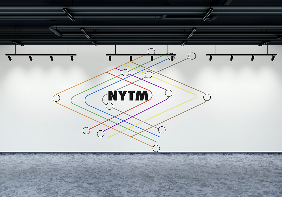
I used bold shapes, a grid system, and subway-inspired colors to reflect movement, structure, and NYC energy. The design is clean, modern, and easy to recognize across different formats.
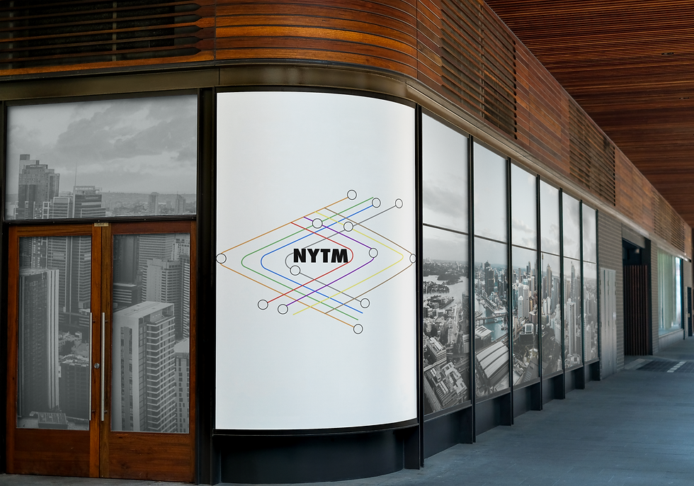
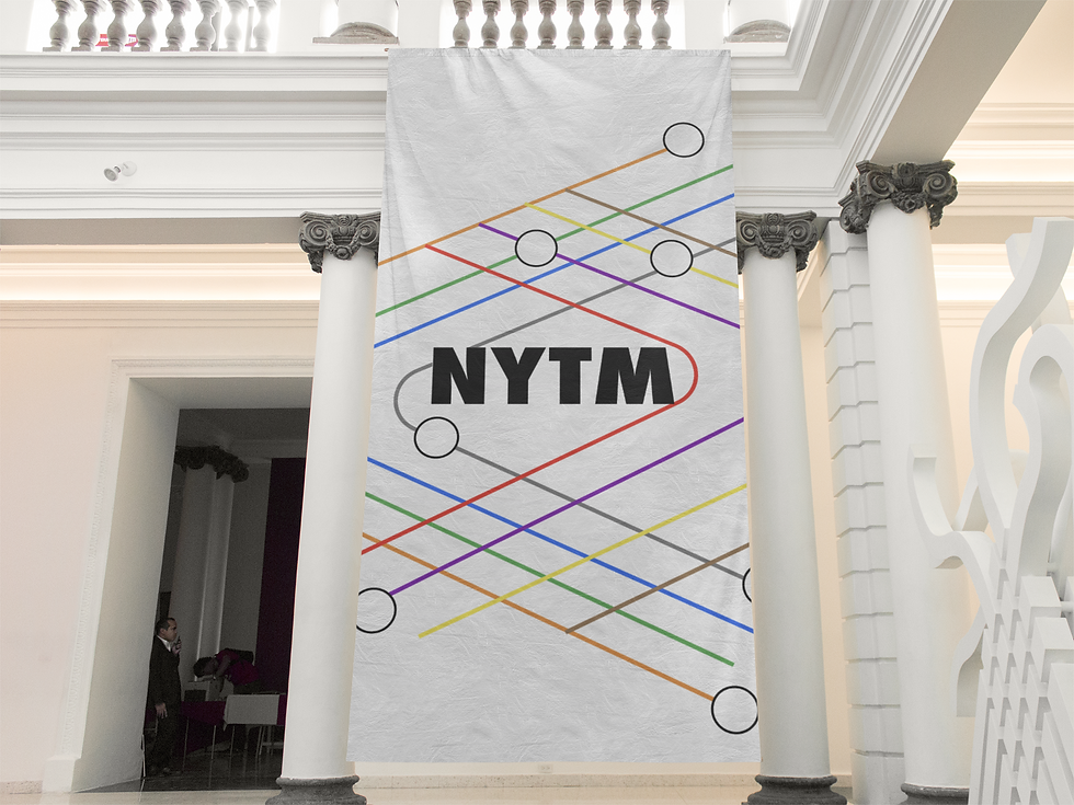
The goal of this project was to redesign the New York Transit Museum’s logo and branding in a way that feels modern but still connected to the city's history.
I wanted the design to reflect the movement and structure of the subway while staying simple, bold, and easy to recognize.
The brand needed to feel familiar to New Yorkers, but also welcoming to people visiting the museum for the first time.
LOGO
Logo Decisions
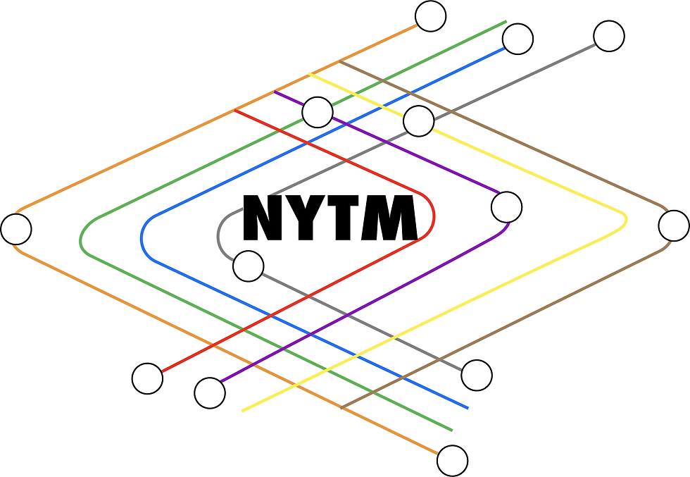
When designing the logo, I thought about how subways twist, turn, and connect. That gave me the idea to use clean shapes like circles, rectangles, and lines like train routes or tunnels.
I wanted the logo to feel like it’s always moving forward, just like how the trains keep going. I also looked at subway signs how simple but strong they are.
That’s why I kept the logo geometric and bold. Nothing too fancy or confusing just clear and familiar, something people could instantly connect to New York.
I built the shape using a grid system so everything lined up and felt balanced just like a real subway map.
Overall, the shape came from thinking about motion, structure, and the energy of New York and how to keep that feeling inside a simple, clean design.
TYPOGRAPHY
Color Decisions
I picked colors based on the real NYC subway lines to make the brand feel familiar and bold. The mix of colors shows movement, energy, and helps tie everything back to New York’s transit system.
Typography Decisions
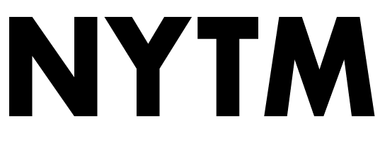
I chose Futura Bold because it’s a strong, geometric typeface that reflects the structure and movement of New York’s subway system.
Its clean, modern look feels both historical and timeless, which fits the Transit Museum’s mission.
The bold weight makes it easy to read on signage and logo applications, while the precise curves and lines pair well with a grid-based design system.
COLORS
PATTERN

.png)